Category: Content

  • 5 Ways to Declutter Your Website and Engage More Visitors

    5 Ways to Declutter Your Website and Engage More Visitors

    A cluttered website is one of the quickest ways to drive potential customers away. Think of your website like a room in your home—if it’s filled with boxes stacked messily on top of each other, it’s difficult to find what you need.

    Your website visitors don’t want to navigate a chaotic digital space. They’re looking for solutions to their problems, and they want those solutions to be clear, accessible, and easy to find. If your website is too overwhelming, they’ll leave before even discovering what you have to offer.

    Let’s explore five effective ways to declutter your website and create a more engaging experience for your visitors.

    1. Simplify Your Menu

    An overloaded menu confuses and overwhelms your visitors. Instead of offering endless options, streamline your navigation to include only the most important pages. Clearly label your menu items with simple, descriptive language to make navigation effortless.

    Too many choices can lead to decision paralysis, causing visitors to bounce from your site before taking any meaningful action. Keep your navigation simple, intuitive, and goal-focused to enhance usability and improve engagement.

    2. Allow White Space to Breathe

    White space is a powerful yet often overlooked design element. It breaks up content into easily digestible sections and helps emphasize key elements like headlines, images, and calls to action.

    A website without sufficient spacing between sections can feel overwhelming and cluttered. Instead of cramming everything onto one screen, embrace white space to create a clean, visually appealing layout that guides visitors naturally through your content.

    3. Use Images Sparingly

    While images enhance visual appeal, using too many can make your site feel chaotic. Every image should serve a clear purpose—whether to support a key message, showcase a product, or improve user experience.

    Instead of filling your homepage with an excessive number of images, be strategic in their placement. Ensure they are high-quality, relevant, and optimized for fast loading speeds to avoid slowing down your website.

    4. Use Valuable Content Only

    If a piece of content isn’t providing value to your visitors, it doesn’t belong on your website. Conduct regular content audits to assess whether your information is still relevant, engaging, and aligned with your brand’s goals.

    Clear, concise, and well-organized content enhances readability and keeps visitors engaged. Prioritize high-quality content that answers your audience’s questions efficiently and encourages them to take action.

    5. Dial Back the Colors

    Vibrant, eye-catching colors can be engaging, but too many bright hues can create visual overload. Instead of using multiple bold colors throughout your website, opt for a balanced approach.

    Use neutral tones for backgrounds and incorporate bold colors as accents for buttons, call-to-action elements, or key features. A well-thought-out color palette improves readability, enhances user experience, and helps guide visitors toward conversion.

    Final Thoughts

    Decluttering your website isn’t just about aesthetics—it’s about creating a better experience for your visitors. By simplifying your menu, utilizing white space, strategically placing images, refining your content, and streamlining your color palette, you’ll make your website more user-friendly and engaging.

    A clean, easy-to-navigate website encourages visitors to stay longer, explore more, and ultimately take action—whether that means making a purchase, booking a service, or signing up for your newsletter. Start decluttering today and watch your website’s engagement grow!

  • Five website examples that make a great first impression

    Five website examples that make a great first impression

    If your website was a person trying to sell a great new business idea, would it pass the elevator pitch?

    You have approximately 5 seconds to grab the attention of somebody visiting your website. If nothing engages them or communicates a clear message, they’ll quickly leave, never to return again.

    So what can you do to ensure your website grabs your visitor’s attention instantaneously? Let’s take a look at 5 examples of websites that make a great first impression.

    1. Clear and Engaging Message

    A website should instantly reassure visitors that they’re in the right place. A concise, compelling message helps first-time visitors quickly understand what the site offers. The message should answer three key questions immediately: What is this? Who is it for? Why should I care? If a visitor has to dig for answers, they’re likely to leave before engaging further.

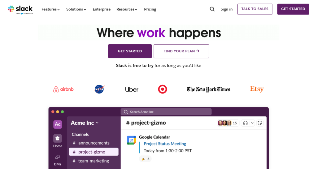
    A strong first impression often hinges on clarity and simplicity. Businesses like Dropbox, Airbnb, and Slack use brief, punchy headlines that leave no room for confusion. The moment a visitor lands on their homepage, they understand the value proposition. A great website message doesn’t just inform—it resonates with the target audience, making them feel like they’ve found exactly what they need.

    Takeaway: Use concise headlines and subtext to immediately inform visitors about your service or product.

    Slack’s “Where work happens” message removes any confusion about the product’s function.

    2. Visually Stunning and Brand-Consistent Design

    A website’s design is often the first thing a visitor notices. The combination of colors, typography, layout, and imagery plays a crucial role in building trust and reinforcing brand identity. A well-designed website should evoke a positive emotional response, making visitors want to stay and explore. It’s not just about looking pretty—it’s about usability and storytelling through design.

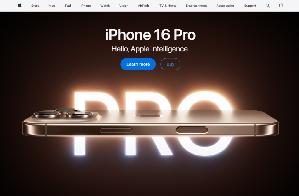
    For example, Apple’s website embraces minimalism with clean lines, ample white space, and high-quality imagery that conveys a sense of sophistication. Nike’s bold visuals reflect the energy and passion of sports, while Mailchimp uses a quirky, friendly design to make digital marketing feel accessible and engaging. These brands leverage design elements to create a strong emotional connection with their audience.

    Takeaway: Keep visuals clean, brand-aligned, and engaging to make a lasting first impression.

    Clean, minimalist design with high-quality product images help shape Apple’s premium feel.

    3. Fast and Efficient Loading Speed

    Speed is one of the most critical factors in user experience. Studies show that if a page takes longer than three seconds to load, over half of users will abandon it. This means even the most beautifully designed website will fail if it doesn’t load quickly. Speed influences not only user retention but also search engine rankings, making it essential for overall performance.

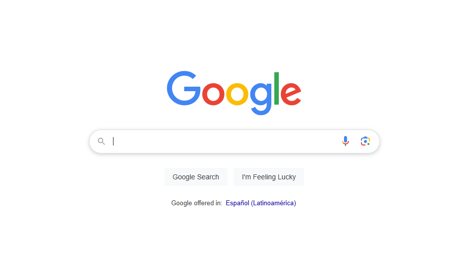
    Brands like Google, Amazon, and Shopify prioritize speed through optimized images, caching, and efficient coding. They ensure that visitors don’t experience unnecessary delays, keeping engagement levels high. Google’s ultra-lightweight homepage loads instantly, while Amazon and Shopify use advanced content delivery networks (CDNs) to handle high traffic loads without lag. These optimizations significantly impact conversions and user satisfaction.

    Takeaway: Use tools like Google PageSpeed Insights to test and improve your site’s speed.

    Google loads almost instantly with a lightweight, optimized structure.

    4. Easy and Intuitive Navigation

    Navigation plays a crucial role in guiding visitors through a website and helping them find the information they need quickly. A confusing or cluttered menu can frustrate users and drive them away. Great websites have clear, structured navigation that makes moving from one page to another seamless. Simple layouts, logical categories, and well-placed calls to action (CTAs) improve usability and engagement.

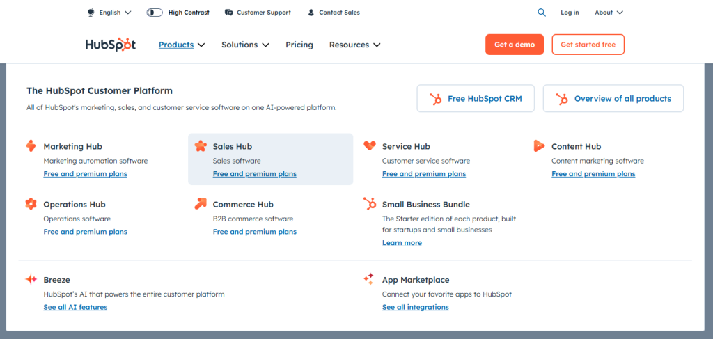
    Zappos, BBC News, and HubSpot excel in navigation design by prioritizing user experience. Zappos categorizes products effectively, making shopping easy. BBC News presents articles in an organized manner, allowing readers to quickly access relevant content. HubSpot offers a user-friendly dropdown menu and search bar, ensuring visitors can locate tools and resources effortlessly. These websites show that intuitive navigation encourages users to explore further.

    Takeaway: Make navigation intuitive with a clear menu structure and search functionality.

    HubSpot’s simplified dropdown menus and search features improve usability for first-time visitors.

    5. Engaging and Persuasive Copy

    The words on a website play a huge role in influencing visitors. Great copywriting is not just about providing information; it’s about crafting a message that connects with the audience and persuades them to take action. The best websites use clear, compelling, and benefit-driven language to hook readers instantly. Avoiding jargon and keeping messaging concise ensures visitors quickly grasp the core message without feeling overwhelmed.

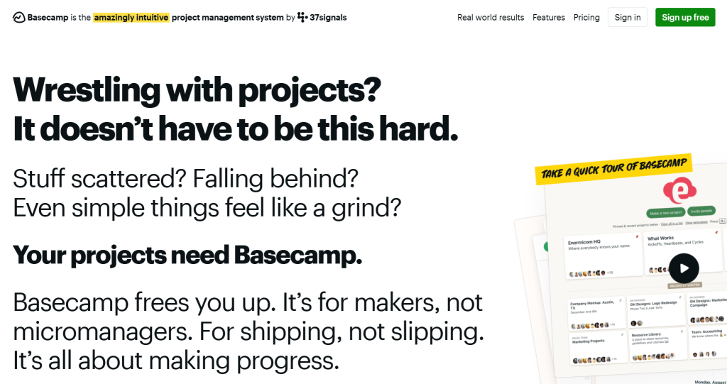
    For example, Basecamp’s conversational tone makes project management feel approachable. Trello highlights its ease of use with simple, engaging language, while Spotify’s copy encourages immediate action with phrases like “Play millions of songs for free.” These brands understand that copywriting isn’t just about what you say—it’s about how you make the visitor feel.

    Takeaway: Ensure your website copy is concise, benefits-driven, and easy to read to keep visitors engaged.

    Basecamp’s conversational and relatable copy makes project management feel simple.

    What about your website?

    Now that we’ve discussed that making a great first impression with your website requires balancing message clarity, visuals, speed, navigation, and copy, is your website making the right first impression?

    Use these examples as inspiration to refine your own site or let us help you create a high-performing, visually engaging, and fast-loading website that and turns first-time visitors into engaged users.